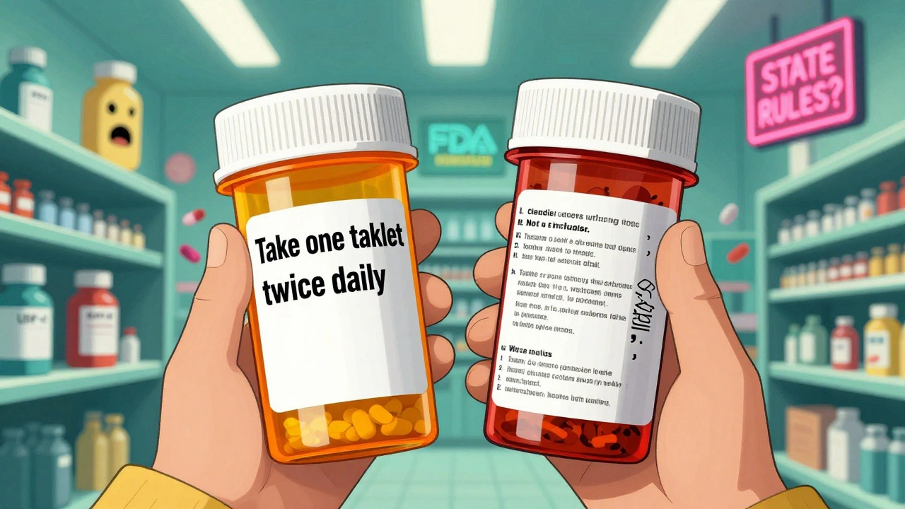
Have you ever opened a new prescription and thought, Wait, this label looks nothing like last time? You’re not imagining it. One month, your pill bottle has big, clear instructions in black font on a white background. The next refill? Smaller text, weird spacing, and suddenly your medicine is labeled for ‘hypertension’ instead of ‘high blood pressure’. It’s not a mistake - it’s the system.
Why Prescription Labels Vary So Much
There’s no single rulebook for what a prescription label should look like in the United States. That’s why your bottle from CVS might look completely different from the one you get at a local pharmacy, or even from the same pharmacy six months later. The federal government, through the FDA, only requires a few basic things: your name, the drug name, the dosage, and the Rx only symbol. Everything else? That’s up for grabs. State pharmacy boards make their own rules. Texas says the font must be at least ten-point Times Roman. California requires bilingual labels for certain drugs. New York has different spacing rules than Florida. Even within the same state, two pharmacies using different software systems can spit out labels that look like they came from different planets. One pharmacy might put the instructions at the top. Another might bury them under layers of legal jargon.What the Experts Want: USP <17> Standards
In 2012, the United States Pharmacopeial Convention (USP) released General Chapter <17> - a set of evidence-based guidelines designed to make prescription labels actually understandable. These aren’t just suggestions. They’re built from decades of research on how people read, understand, and misread medication instructions. USP <17> says labels should:- Use sentence case: Take one tablet by mouth twice daily - not TAKE ONE TABLET BY MOUTH TWICE DAILY
- Use a clean, non-condensed sans-serif font like Arial or Helvetica
- Keep line spacing at 1.5 to avoid crowding
- Print in high contrast: black on white, never gray on beige
- Write in plain language: for high blood pressure, not for hypertension
- Include the reason for the medicine - not just the name
- Make instructions stand out visually
The Real Danger: Confusion Leads to Mistakes
This isn’t about aesthetics. It’s about safety. A 2021 survey by the National Community Pharmacists Association found that 68% of patients have had trouble understanding their prescription labels at least occasionally. One in five - 22% - said they’d made a medication error because of confusing labels. One Reddit user shared how they took double their blood thinner dose because the label changed between refills. Last time, it said ‘Take 1 tablet twice daily’. This time, it said ‘Take 1 tablet, twice daily’ - with a comma that made it look like two doses at once. They didn’t notice until they ended up in the ER. Dr. Michael Cohen of the Institute for Safe Medication Practices says name confusion and unreadable labels are the top two reasons for medication errors. He estimates that if every label followed USP <17>, medication errors could drop by 30 to 40%.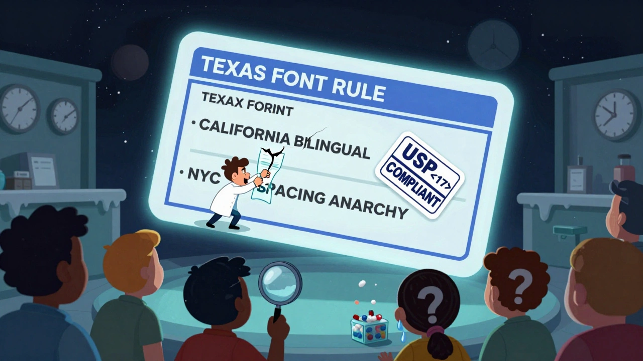
Why Isn’t Everyone Using Better Labels?
Because changing labels costs money - and no one is forcing them to. Pharmacies use dozens of different computer systems to print labels. Upgrading each system to meet USP <17> standards can cost between $2,500 and $7,000 per location. Staff need training. Labels have to be redesigned. Compliance teams have to review everything again. As of 2023, only 28 states have officially adopted USP <17> in some form. Only 15 have full implementation. Even CVS, one of the biggest pharmacy chains in the country, only committed to switching all 10,000+ locations in 2023 - with a deadline of December 2024. And accessibility? Forget it. Only 38% of pharmacies offer large-print labels. Just 12% offer braille. Five percent offer audio labels. That’s not just inconvenient - it’s dangerous for older adults or people with vision impairments.What’s Changing - and What’s Coming
There’s momentum. The Biden administration’s 2022 Patient Safety Action Plan set a goal: 90% of states will adopt standardized labeling by 2026. The FDA issued draft guidance in June 2023 titled ‘Enhancing Patient Understanding of Prescription Drug Container Labels’. That’s a clear signal they’re considering making USP <17> mandatory. Meanwhile, tech is stepping in. Apps like Medisafe and MyTherapy now scan your physical label and translate it into a clean, consistent digital version. Smart pill bottles with Bluetooth and LED reminders are popping up. They don’t fix the label problem - they bypass it. But real change has to start at the bottle.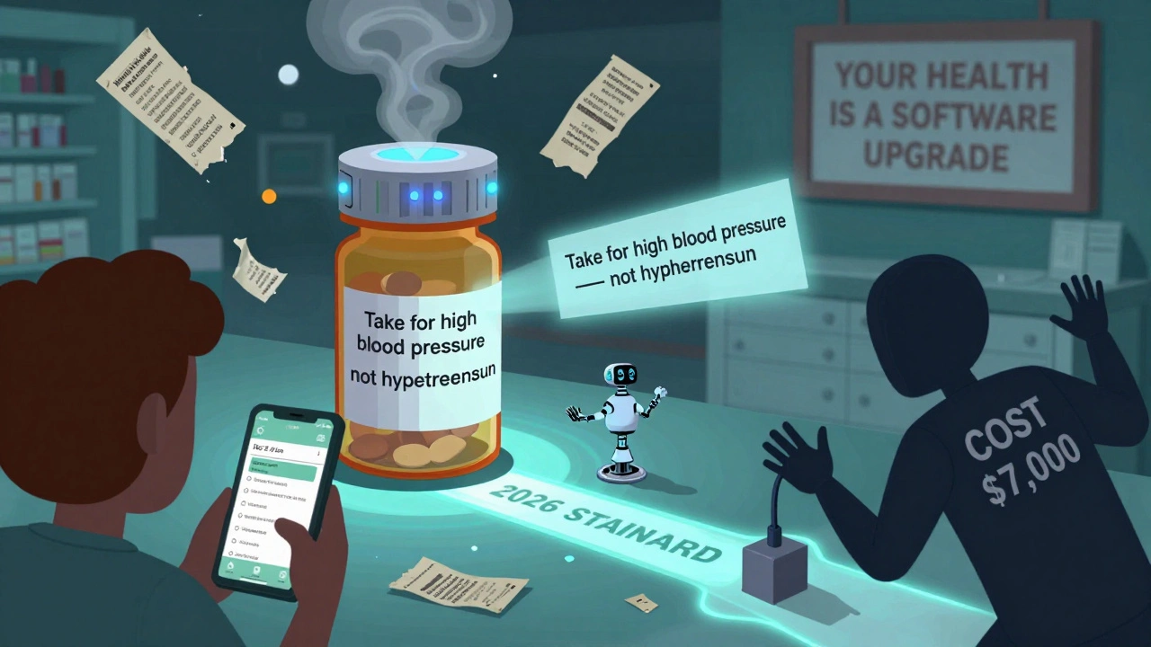
What You Can Do Right Now
You don’t have to wait for the system to fix itself.- Ask for a plain-language version. Say: ‘Can you print this in simpler language? I want to know why I’m taking this.’
- Request large print or audio labels. If your pharmacy doesn’t offer them, ask why - and ask for alternatives.
- Take a photo of your label. Save it on your phone. Compare refills. If the wording changes, call the pharmacy.
- Use a pill organizer with printed instructions. Write out your own instructions in big letters.
- Ask your pharmacist to explain it. Don’t assume you understand. Say: ‘Can you read this back to me so I’m sure I got it right?’
Ugh i just got a new script and the label looks like it was printed by a toddler with a printer that's almost out of ink
why is the font so tiny and why does it say 'hypertension' like im supposed to know what that means
they dont even care
you’re not alone i’ve been there too
last month i almost took my heart med twice because the comma placement looked like a typo
but then i called my pharmacist and they printed me a new one in big letters with the reason written out
it felt like they finally saw me as a person not just a barcode
ask for plain language it costs nothing and saves lives
Oh please. This is just another case of medical populism.
USP guidelines? Please. The real issue is patients can’t read basic Latin medical terminology.
Why should pharmacies dumb down language for the statistically illiterate?
My grandfather took warfarin for 20 years and never needed a cartoon label.
Maybe if people learned to read instead of demanding hand-holding, we wouldn’t need this performative compliance.
Also braille on pill bottles? That’s not accessibility, that’s theater.
And who’s paying for this? You? Me? The taxpayer?
It’s all just virtue signaling wrapped in Helvetica.
I appreciate the effort to raise awareness here.
It’s important to recognize that behind every confusing label is someone trying to manage chronic illness while juggling work, family, and insurance.
Standardization isn’t about coddling - it’s about equity.
Everyone deserves to understand what they’re taking, regardless of education level or vision.
And honestly? If a system can’t adapt to basic human needs, maybe it’s the system that needs fixing, not the people.
one thing no one talks about is the software pharmacies use
some of them are from the 90s and still run on windows xp emulators
i work in IT and i saw a pharmacy upgrade last year and they had to pay 12k just to get a new label printer driver
its not laziness its legacy tech nightmare
also typo on the article its USP <795> not just USP
The data is overwhelming. A 27% reduction in patient inquiries and a 19% increase in adherence aren’t just numbers - they’re people who didn’t end up in the ER, didn’t miss work, didn’t panic because they didn’t understand their own medicine.
It’s not about politics or cost. It’s about basic dignity.
Why do we accept that someone’s health should depend on which pharmacy they walk into?
Standardized labels are a minimal, evidence-based intervention with massive impact.
If we can mandate warning labels on cigarettes, we can mandate readable ones on blood thinners.
Let me get this straight - we’re spending millions to make pill bottles look like they were designed by a kindergarten class that just learned about ‘readability’?
Meanwhile, we’re still letting Big Pharma charge $1,200 for a 30-day supply of insulin.
So the real crisis isn’t the font size - it’s that we’ve normalized a system where profit trumps care.
Fix the pricing. Fix the access.
Then we can talk about whether ‘hypertension’ should be ‘high blood pressure’.
Also, braille on a pill bottle? Who’s reading it? A blind person with perfect dexterity who can open a childproof cap? Please.
my grandma took her blood pressure med for 12 years and she never understood what it was for until i sat down with her and read the label out loud
she cried because she felt so stupid for not knowing
but it wasn’t her fault
it was the label
and now she carries a laminated card in her purse with the instructions in big print and the reason written in crayon
because no pharmacy would do it for her
and i’m so angry
we are failing people like her every single day
This is one of those issues that seems small until you realize how deeply it fractures trust in healthcare.
Imagine being elderly, visually impaired, and trying to navigate a label that changes every refill - sometimes in language you don’t fully understand, sometimes with spacing that makes you misread the dosage.
It’s not just inconvenient - it’s a breach of the social contract.
Healthcare should be designed for the most vulnerable, not the most efficient.
And if a $7,000 software upgrade is the barrier? Then we need to fund it.
Because the cost of a single medication error - in lives, in ER visits, in trauma - is orders of magnitude higher.
Let’s stop treating readability as a luxury and start treating it as a right.
Okay but can we also talk about how pharmacies don’t even offer audio labels unless you beg for them? Like seriously?
I asked my mom’s pharmacy for an audio version because she’s got macular degeneration and they said ‘we don’t do that’
so i had to record the label myself on my phone and send it to her
and then i had to call the corporate office and complain and they finally sent a letter saying ‘we’re reviewing our accessibility options’
which means nothing
and meanwhile my mom is still taking pills with tiny letters and no idea if it’s the same as last time
it’s 2024 and we’re still treating people with disabilities like an afterthought
braille? audio? large print? these aren’t luxuries - they’re lifelines
and if you’re a pharmacy that doesn’t offer them, you’re not just behind the times - you’re dangerous